
From Monotonous to Meaningful
Memorique is an AI-powered gifting platform that helps businesses build stronger relationships through personalized and automated gifting.
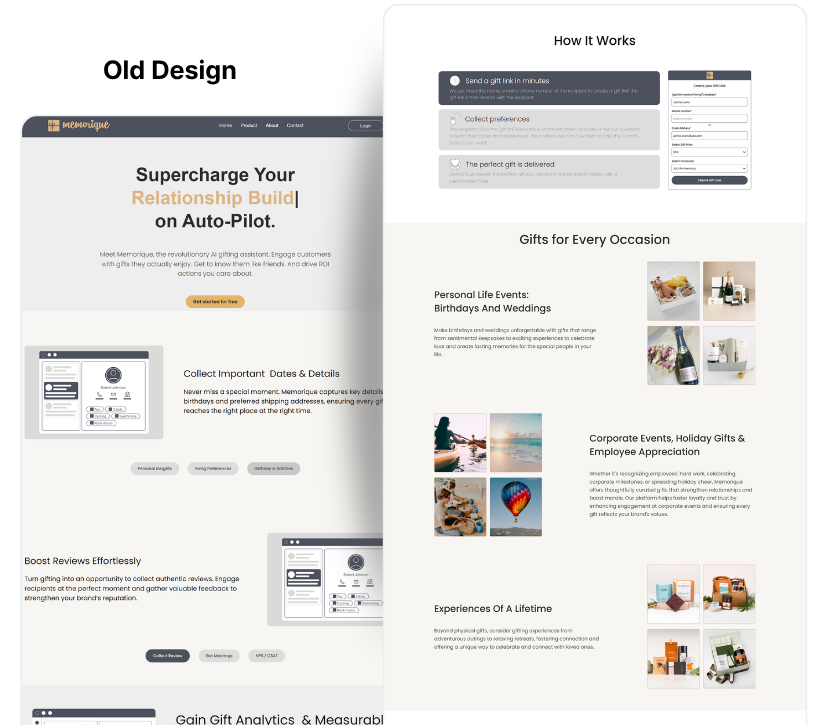
The original website communicated what Memorique did, but the experience felt visually monotonous and difficult to navigate as a story. The heavy use of one dominant blue tone, limited visual variation, and inconsistent content hierarchy made important information easy to overlook.
I redesigned the website to create a more engaging, structured, and conversion-focused experience.
The website explained the product, but didn't guide the user.
The original experience contained valuable information about Memorique, including its gifting capabilities, automation, use cases, and integrations. However, the content felt more like a collection of sections than a guided journey.
The biggest UX challenges I identified were:
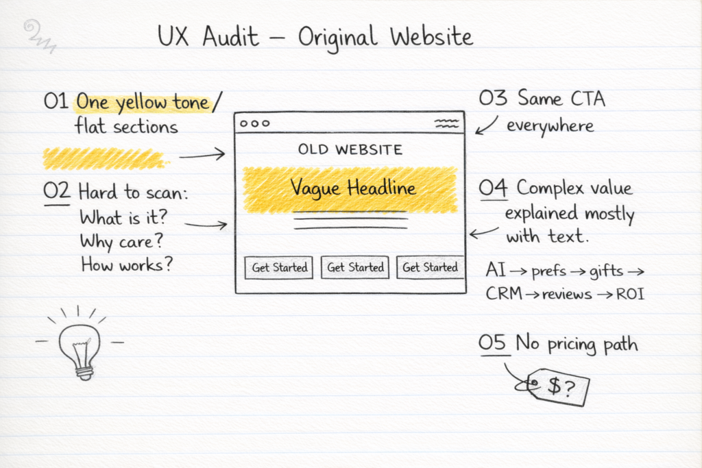
Instead of simply making the website "look better," I defined the redesign goal as:
Create a website experience that helps users understand Memorique quickly, discover its value, and confidently take the next step.
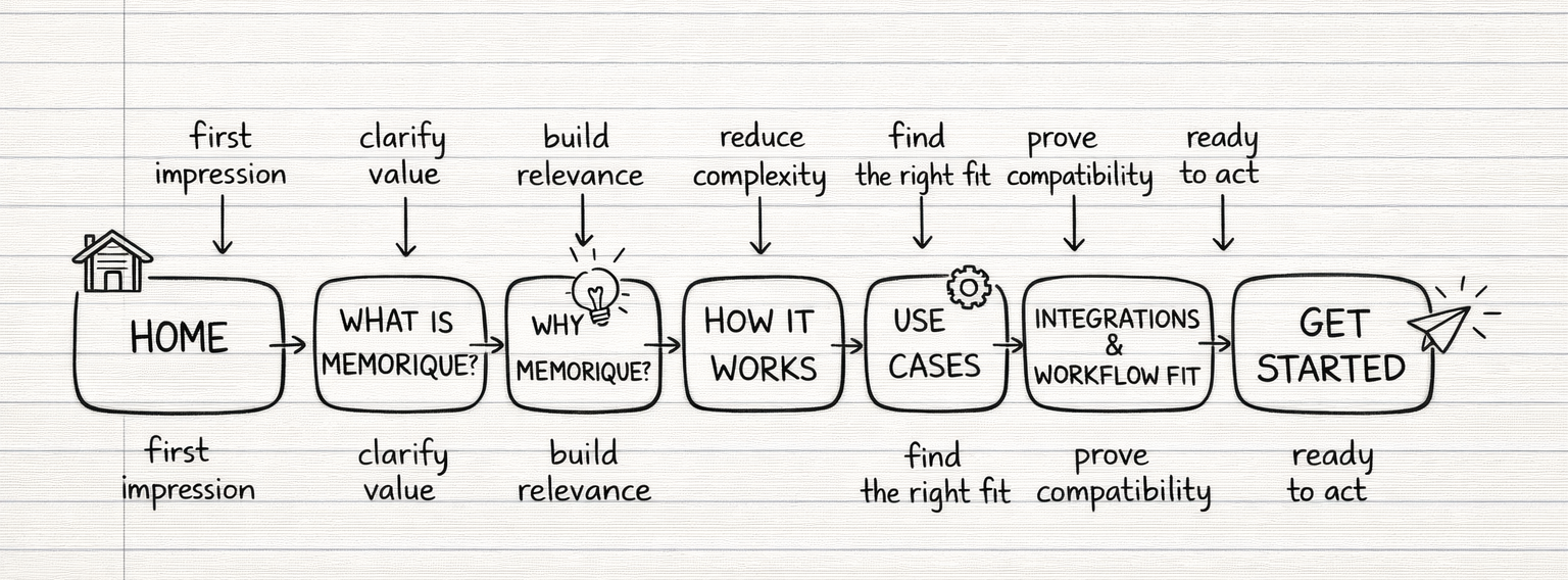
I reorganized the website around a simple user journey:
Understand → Explore → See the Value → Choose a Use Case → Take Action
This helped turn a collection of website sections into a more intentional product story.
I began by reviewing the existing website and understanding how Memorique positioned its product.
I then reviewed competing websites to understand how similar B2B SaaS and gifting platforms approached
Key question
What information does a potential customer need before they feel confident enough to take action?
I restructured the website around the questions users are likely to have.
Proposed journey:
I introduced clearer, context-specific CTAs throughout the journey instead of relying on repetitive "Get Started" messaging.
I also recommended adding pricing or starting-price information to reduce uncertainty and help users evaluate the product before contacting sales.
The redesign established a clearer conversion path and created a stronger foundation for measuring engagement, CTA performance, and lead generation.
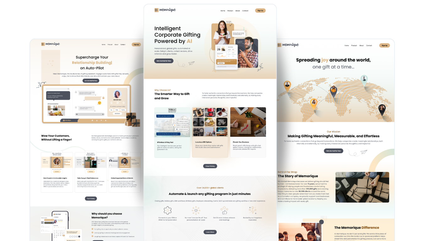
This project reinforced that a website redesign is not simply about making an interface more attractive.
The biggest improvement came from asking:
What does the user need to know at this point in their journey?
By combining research, competitive analysis, information architecture, visual design, and conversion thinking, I was able to turn a visually monotonous website into a more human, engaging, and purposeful experience.