
Museum De Portugal
Museum websites should do more than provide information. They should help people discover, plan, and feel excited about visiting.
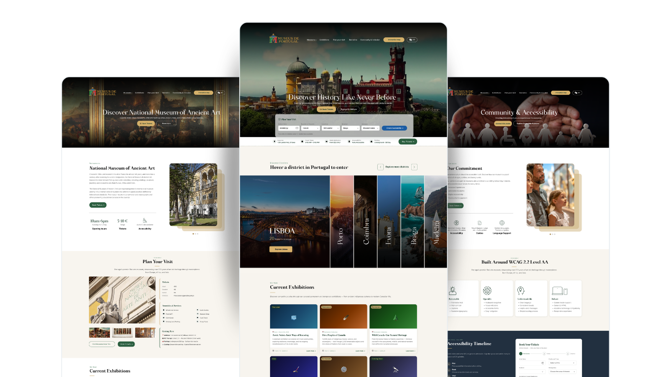
I created Museum de Portugal landing page, a UX concept that rethinks the museum journey through simplified information architecture, WCAG-informed design to make museums more approachable for a wider audience.
How might we make museums feel more accessible and relevant to today's visitors?
We started by reviewing the existing Canadian Museums Association website and exploring why a visitor might struggle to move from discovering a museum to planning a visit.
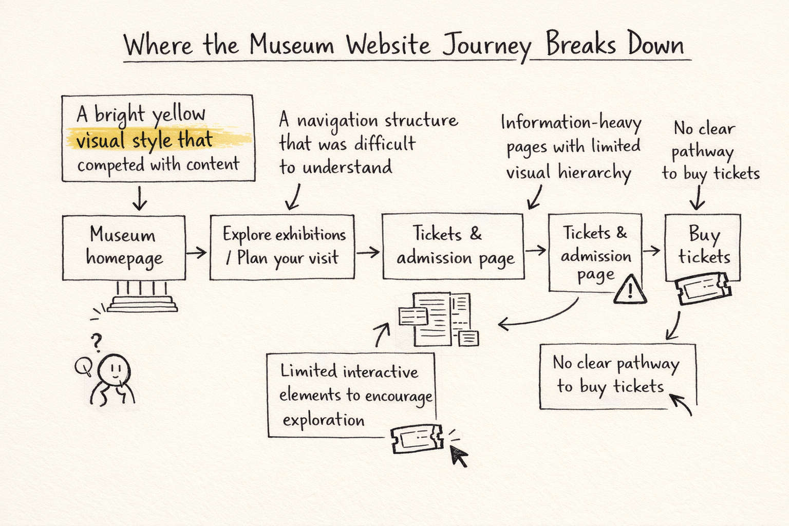
The existing experience was heavily focused on information, but important visitor actions were not always obvious.
Some of the key issues we identified were:
This led us to a bigger UX question:
How can a museum website move beyond simply providing information and become an experience that inspires people to visit?
Museum websites have to serve many different needs, including visitor information, ticketing, events, collections and education, which makes information architecture particularly important.
Understanding what makes people want to visit
We researched museum websites, visitor behaviours and digital accessibility to understand what could make the experience more engaging for a wider audience.
Instead of simply redesigning the existing interface, we asked:
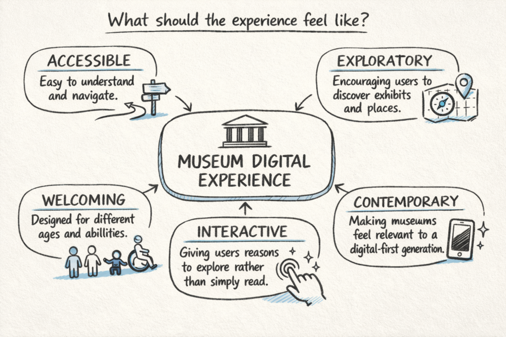
To explore these ideas, we created Museum de Portugal as a fictional museum experience based on our research.
Portugal became the foundation for the concept because its cultural identity, architecture and museums gave us an opportunity to create a more visually engaging experience.
Rather than designing another information-heavy museum website, we created an experience around discovery.
The new experience:
Discover → Explore → Plan → Visit
This became the foundation for our information architecture.
We first mapped the core user flows before moving into visual design.
Key user flow
Homepage → Discover Museum → Explore Exhibition → Plan Your Visit → Interactive Map → Tickets
This helped us identify where users could become lost and where important actions needed stronger visibility.
The final concept transforms the museum website from primarily an information source into a more engaging visitor journey.
This project taught me that museum UX is not just about organizing content.
It is about understanding what a visitor needs at each stage of their journey and making the next step obvious.
The best museum website doesn't just tell people what's inside. It gives them a reason to walk through the door.