
Optimizing the User Journey for Cratic.AI
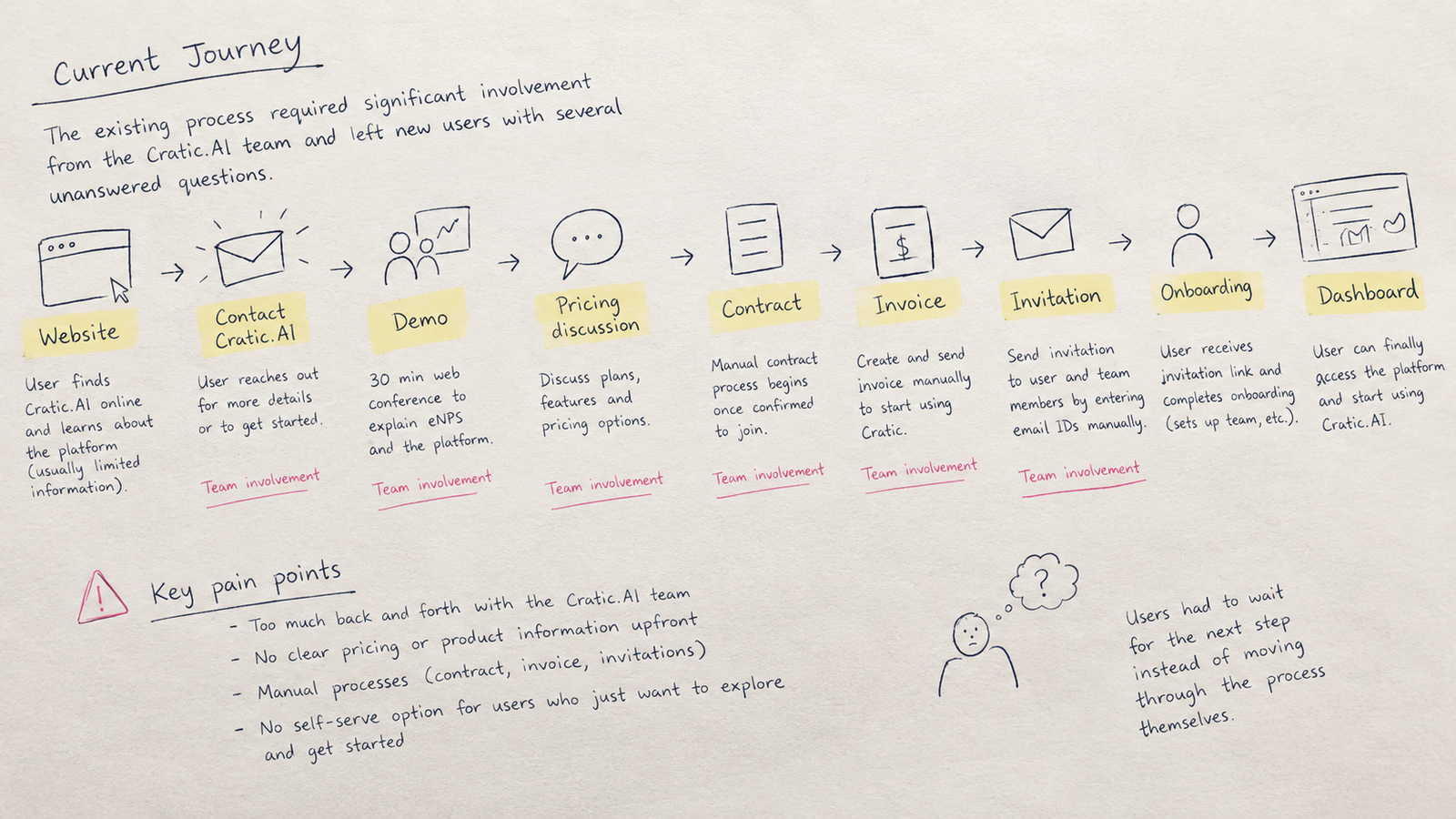
Cratic.AI helps organizations improve team culture through surveys, discussions, and ongoing feedback. The challenge was that getting started with the platform involved several manual steps, from contacting the company and discussing pricing to signing a contract, receiving an invitation, and completing onboarding.
I worked on simplifying this journey into a more direct, self-serve experience.
Getting started with Cratic.AI was more complicated than it needed to be.
A new client would first learn about the platform through a conversation with Cratic.AI, then move through several manual steps involving contracts, invoicing, email invitations, team setup, and onboarding.
The existing journey looked roughly like this:
How might we make the signup and onboarding experience simple enough that a new leader can get started without relying on a manual back-and-forth process?
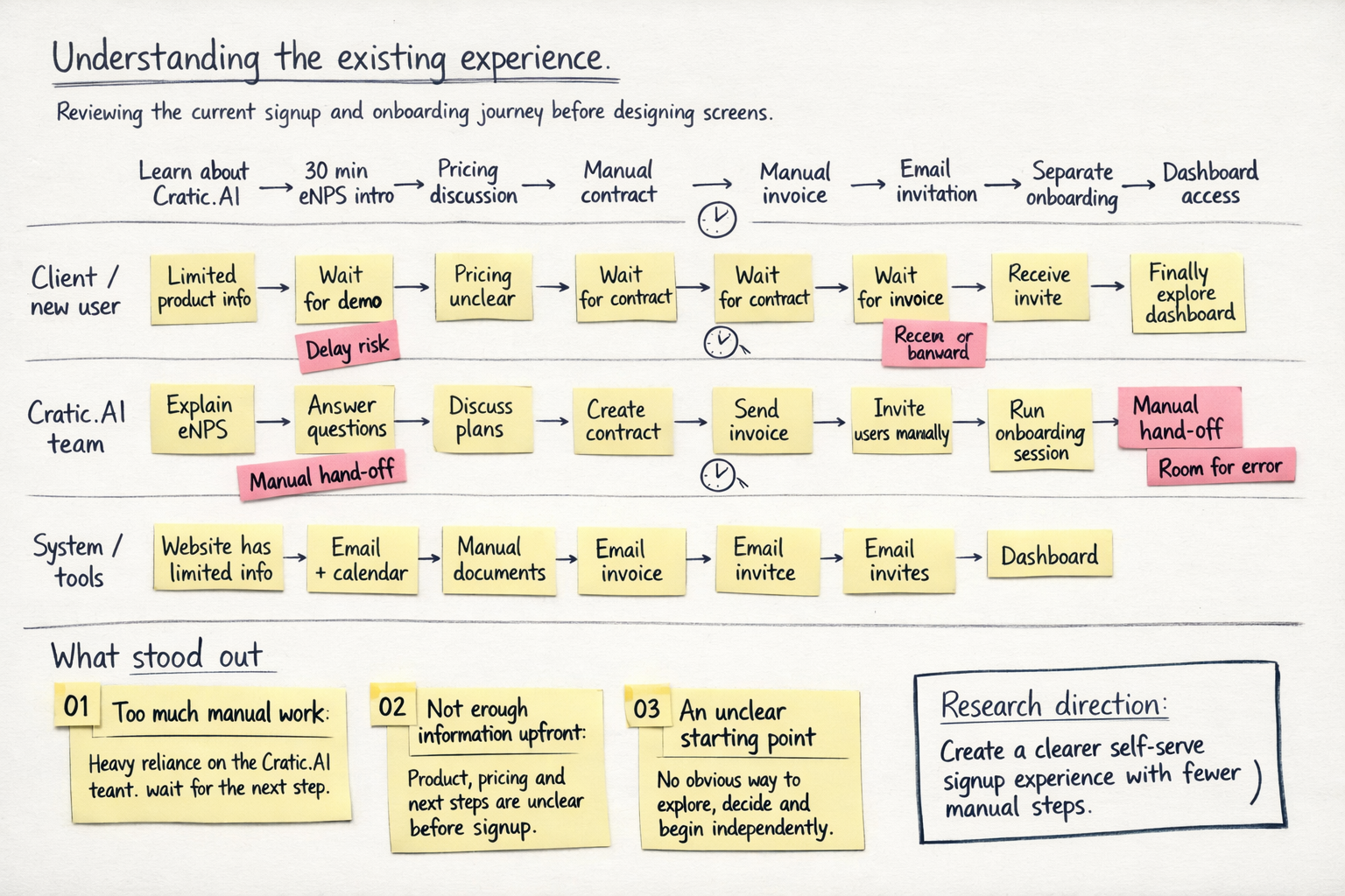
I started by looking at the current signup and onboarding journey rather than jumping straight into screens.
The existing process included a 30-minute introduction to eNPS, manual contracting and invoicing, email-based invitations, and a separate onboarding session.
I also reviewed the existing dashboard and carried out a heuristic evaluation to identify usability issues.
I created a proto-persona based on the interviews.
Meet Mark
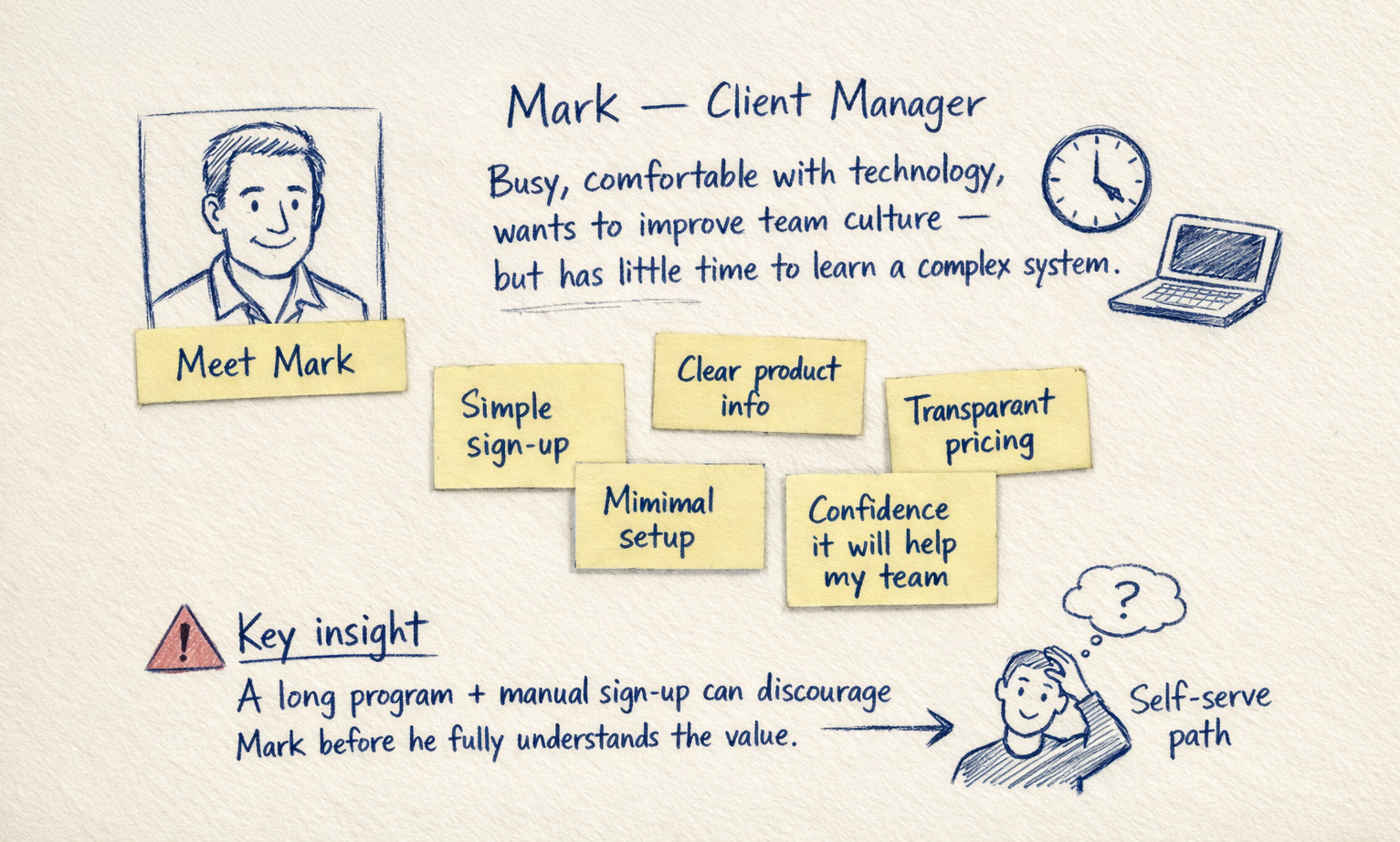
I reviewed the existing experience, conducted a heuristic evaluation, and mapped the user journey to understand where users were getting stuck.
The biggest insight
The problem wasn't just the signup form. The entire journey created friction before users even reached the product.
This shifted the focus from improving one screen to redesigning the end-to-end signup and onboarding experience.
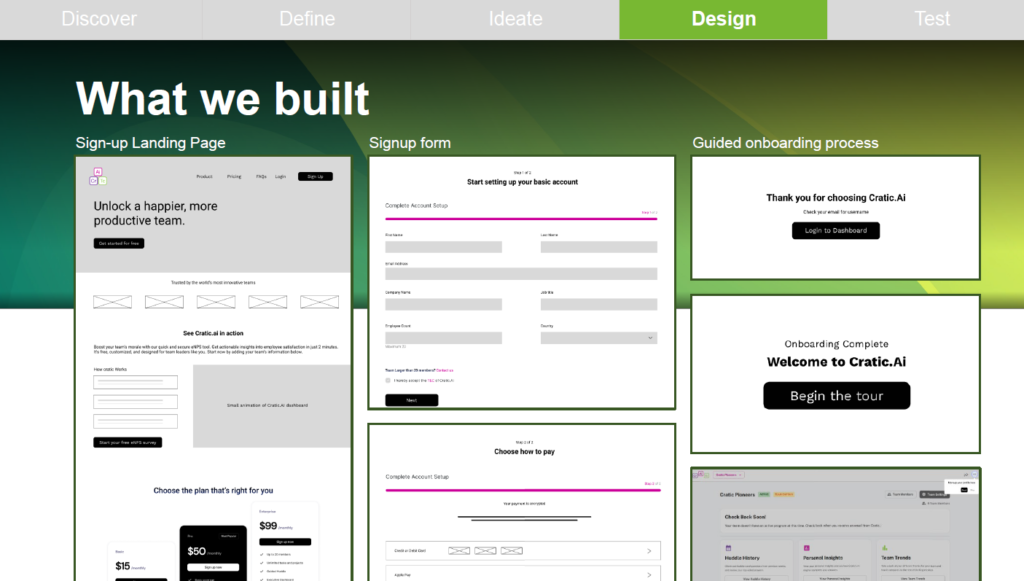
I explored ways to make the experience more self-serve.
Three key changes
01. Clearer landing page
Explain the product, value, pricing and next step.
02. Simpler signup
Collect only the information needed to get started.
03. Guided onboarding
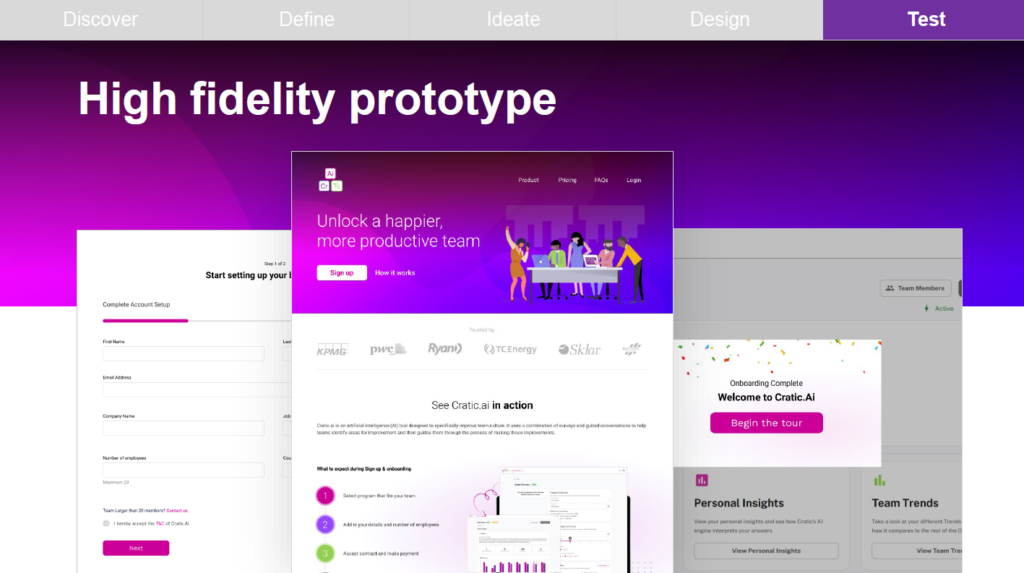
Help users set up their team and understand the dashboard.
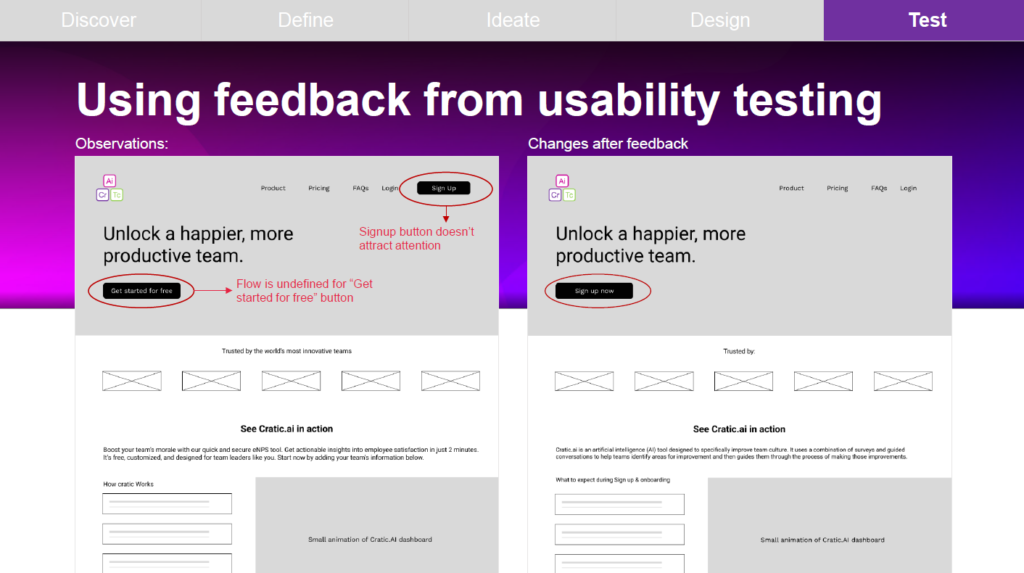
I tested the prototype with 5 participants across key signup and onboarding tasks.
task completion rate
Testing showed that the overall flow was intuitive, but the signup CTA needed to communicate the next step more clearly.
I refined the CTA and visual hierarchy based on the feedback.
Fragmented journey → Self-serve journey
Before
Manual communication
After
Discover → Sign up → Set up team → Explore dashboard
The proposed experience gave users a clearer path from discovering Cratic.AI to getting started, while reducing dependence on manual team involvement.
Good UX isn't just about making screens easier to use. It's about removing friction across the entire journey.
This project strengthened my approach to research → journey mapping → prototyping → testing → iteration.